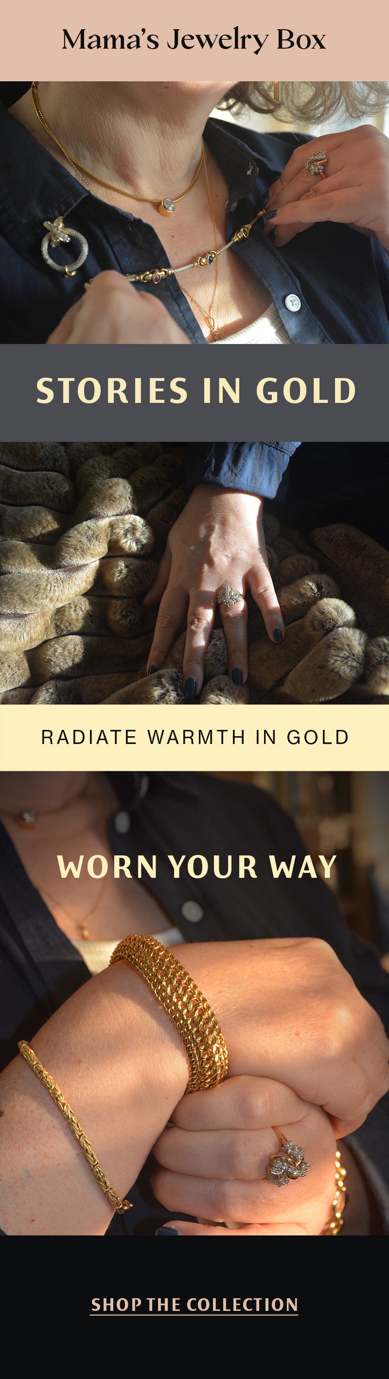
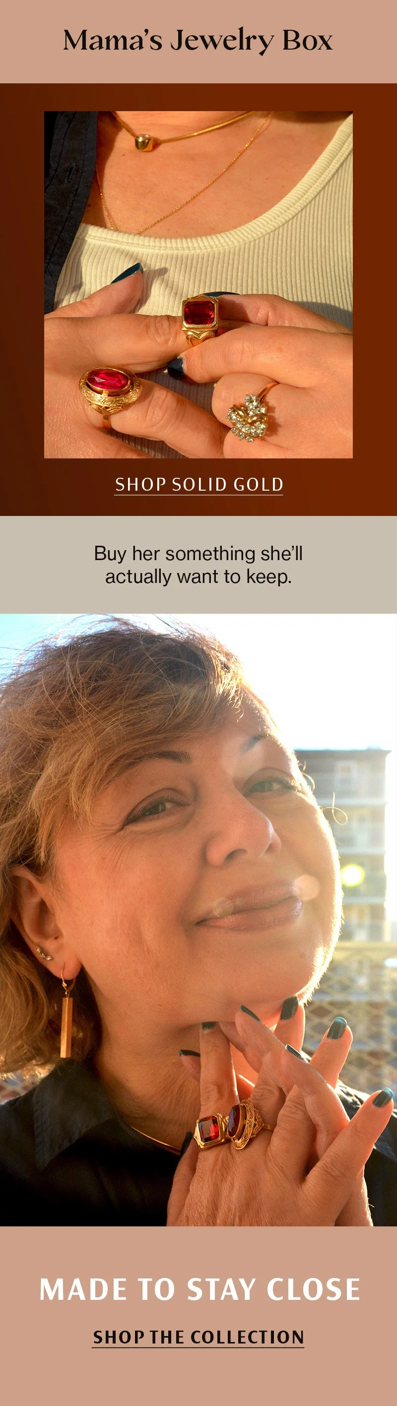
Brand identity exploring how visual systems can communicate memory, care, and emotional value.
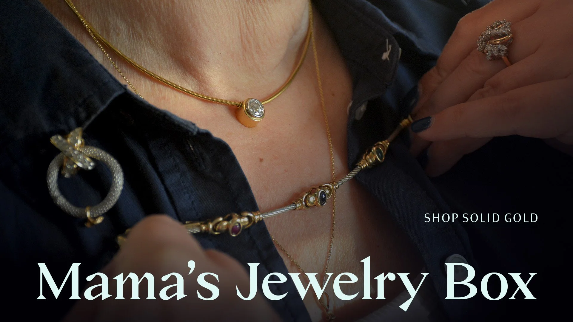
Campaign Banner
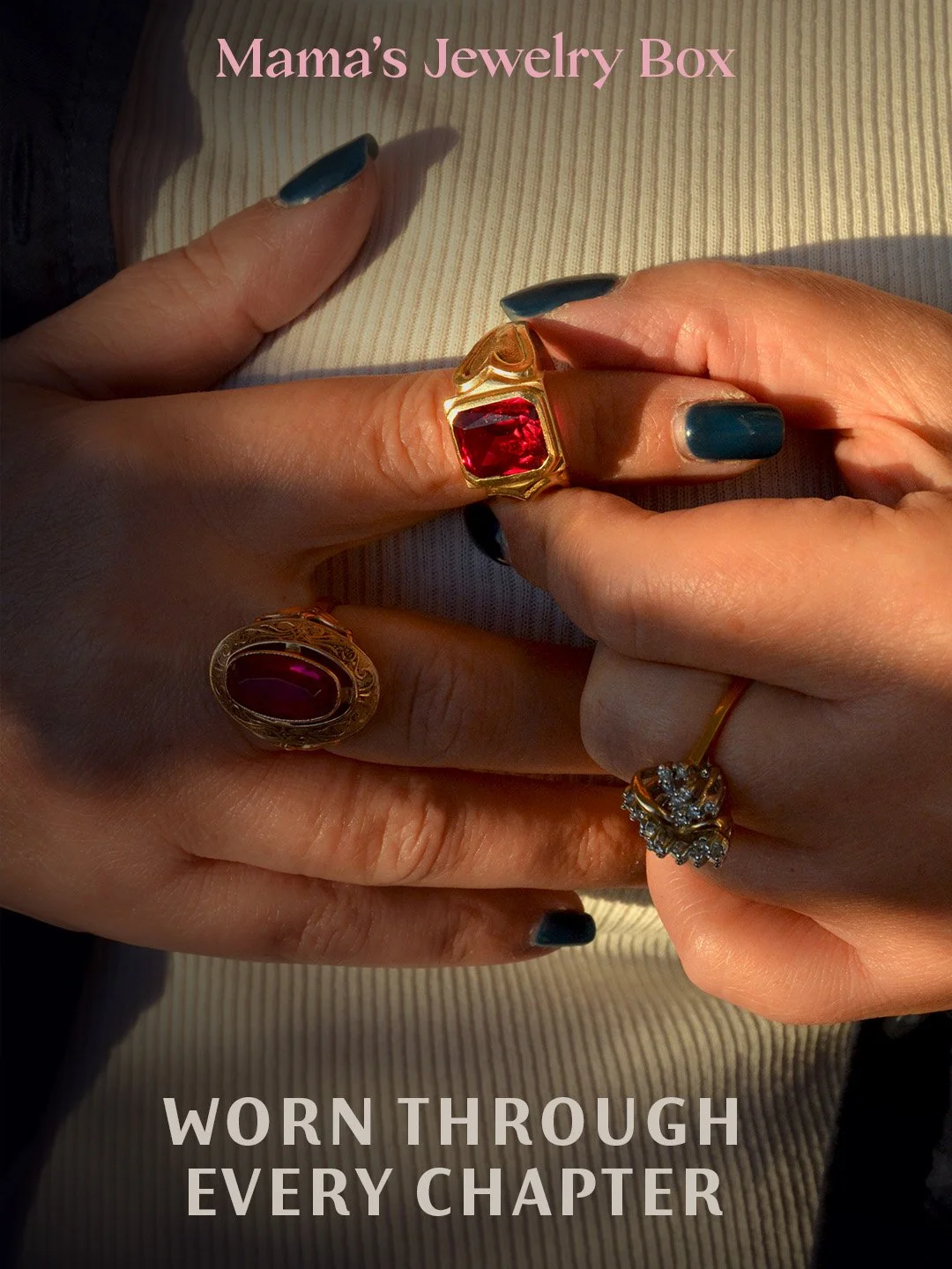
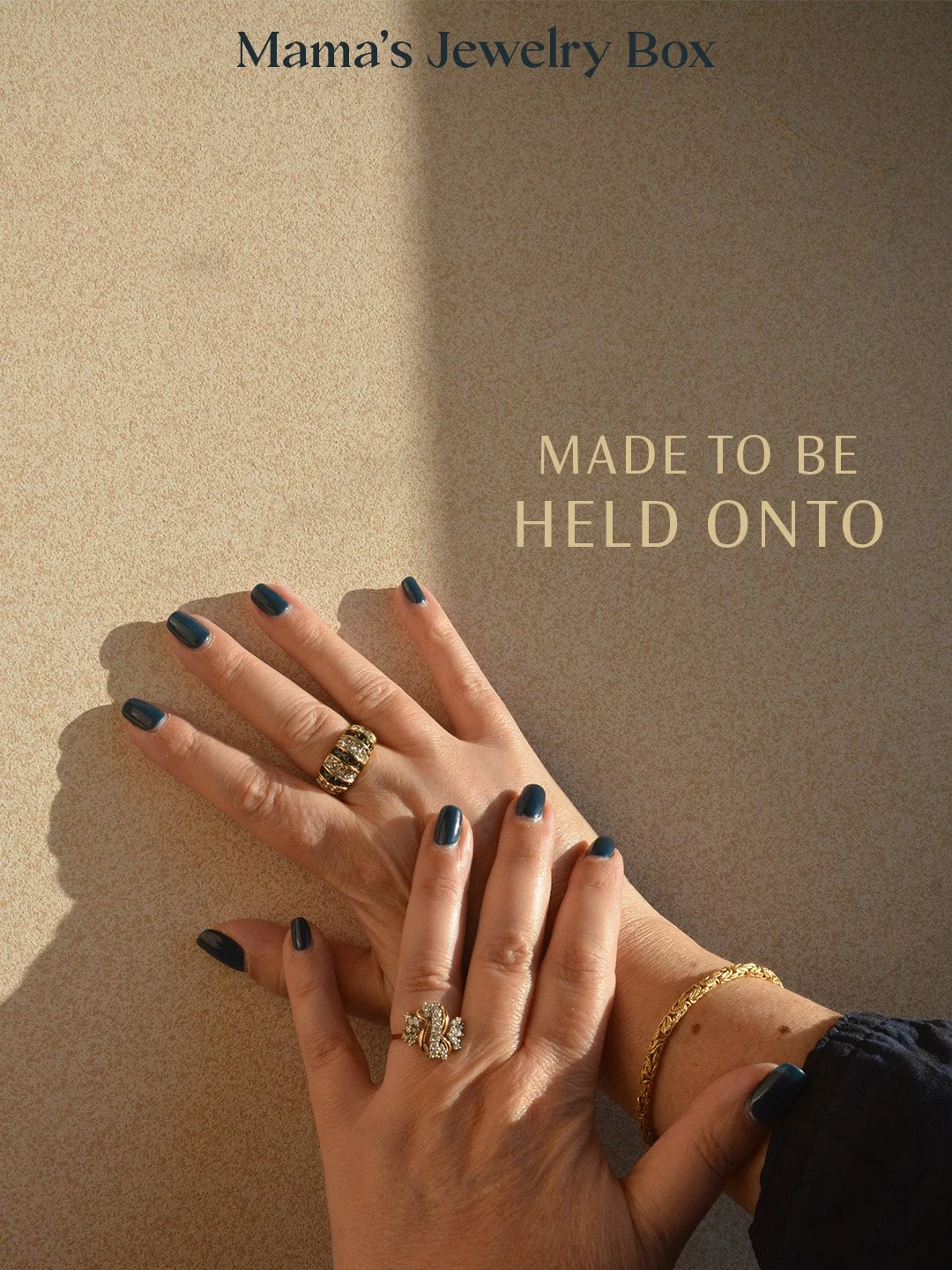
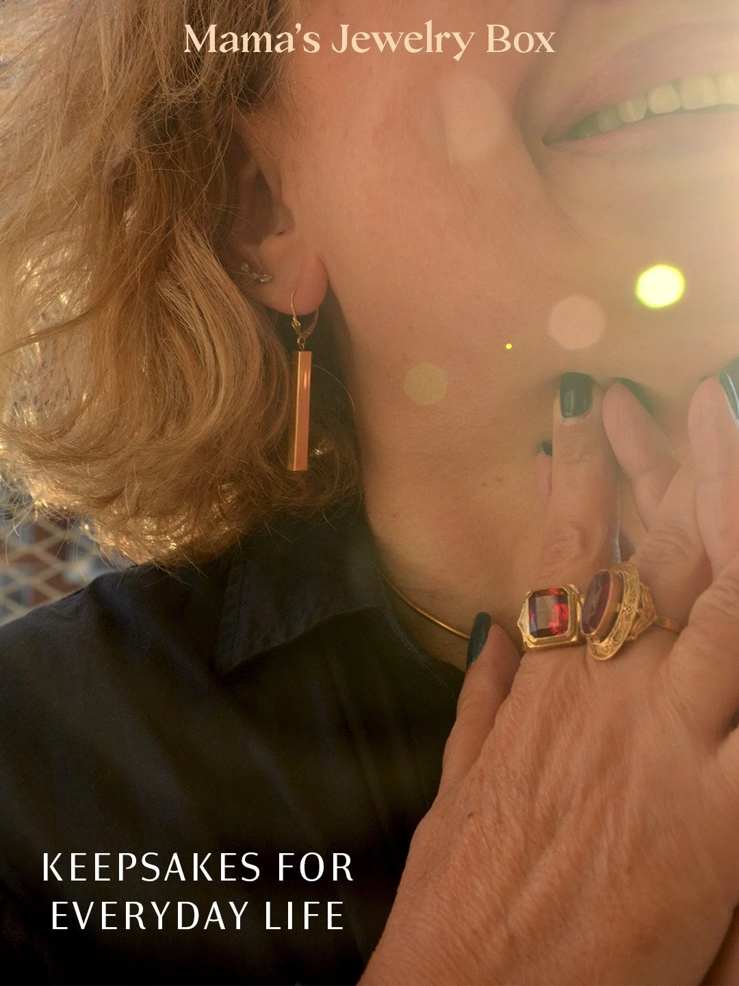
Social Content System
Editorial Email Design
Brand Concept & Visual Identity System
Role:
Brand Strategy, Visual Identity, Art Direction, Photography, Typography, Narrative Development
Objective:
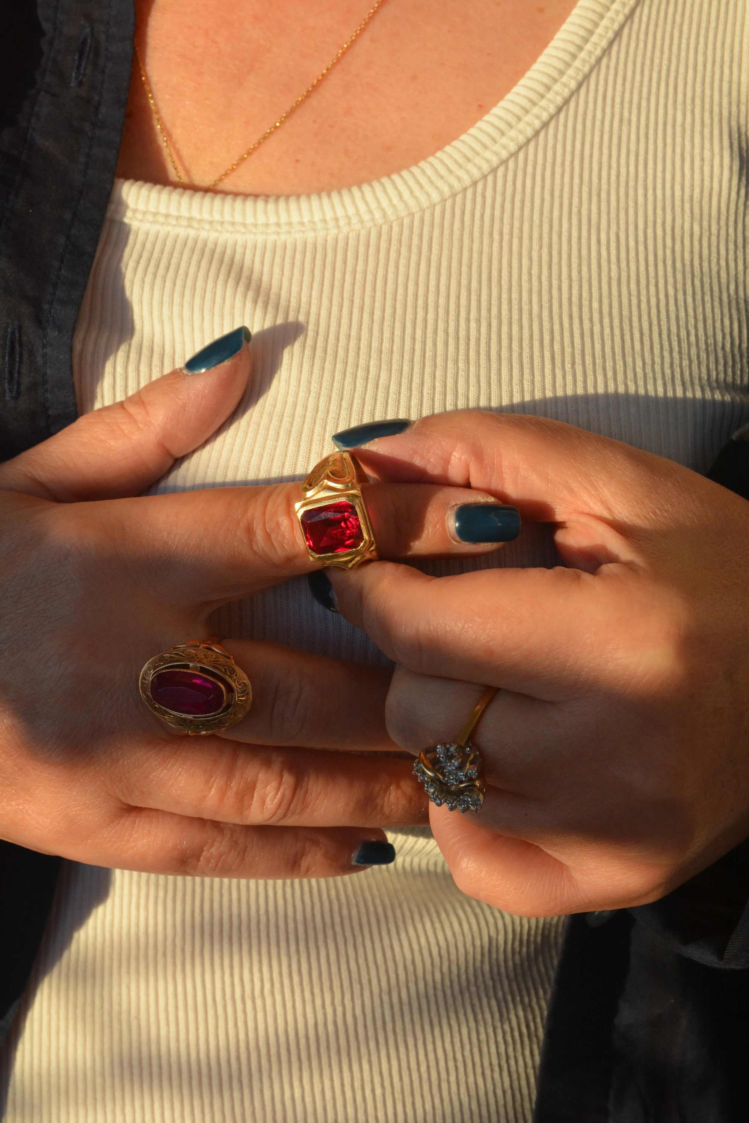
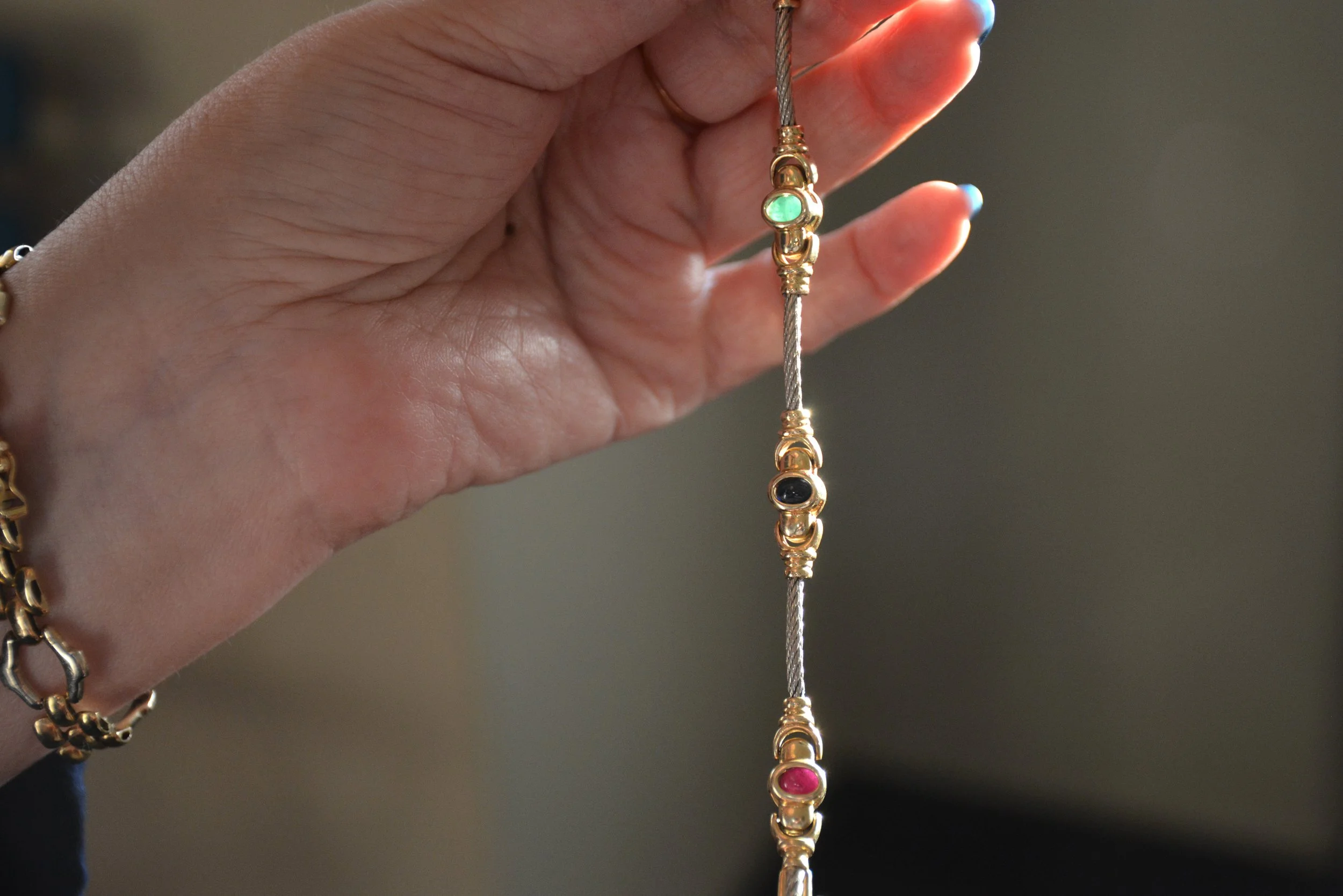
Develop a jewelry brand identity that reframes heirloom objects not as luxury commodities, but as emotional artifacts rooted in memory and inheritance.
Positioning Insight:
Much of the contemporary jewelry market centers on trend, status, or minimal modernism. Mama’s Jewelry Box was positioned instead around intimacy and generational continuity, emphasizing story over spectacle.
Mama’s Jewelry Box
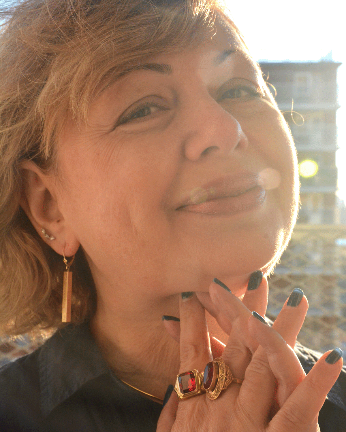
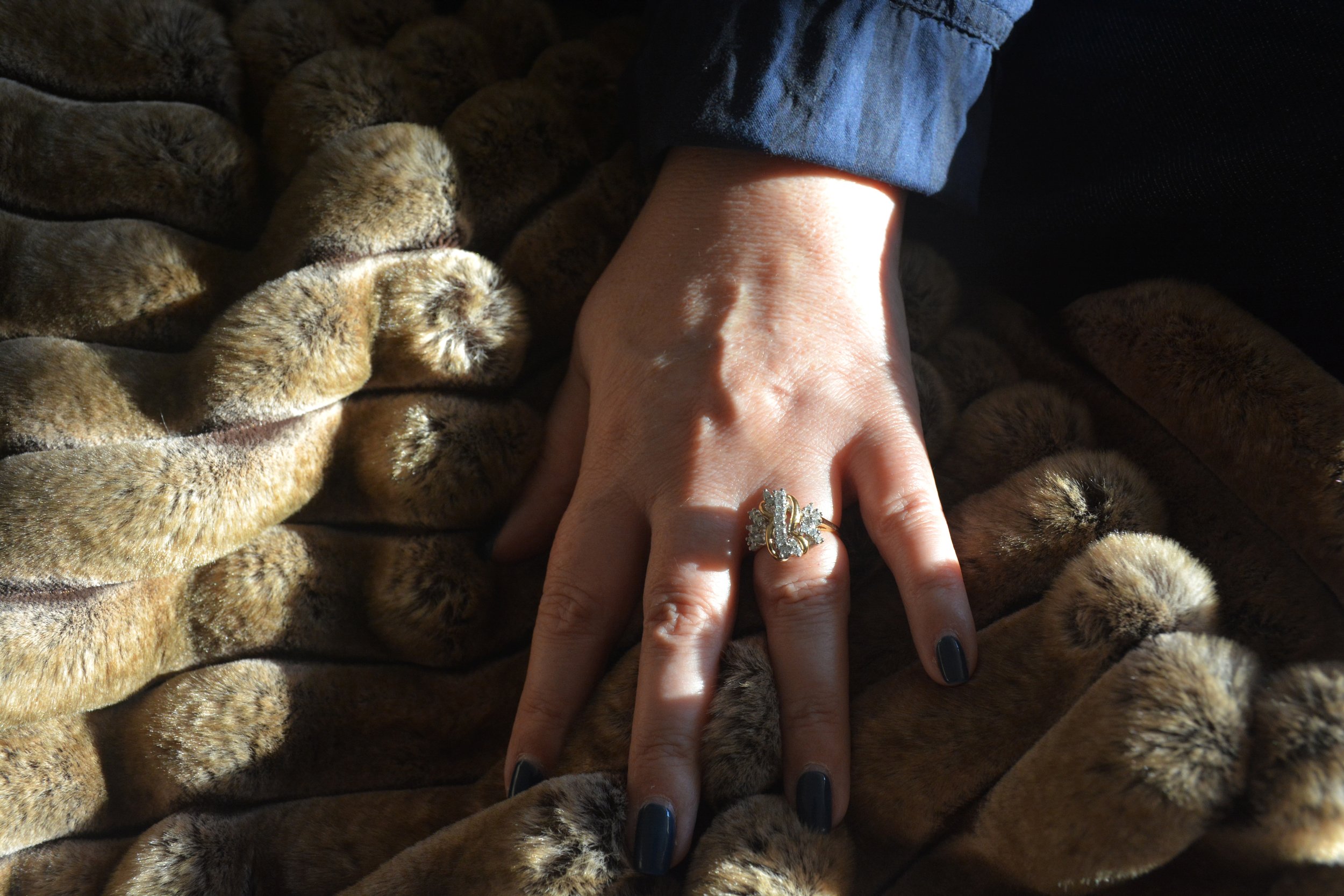
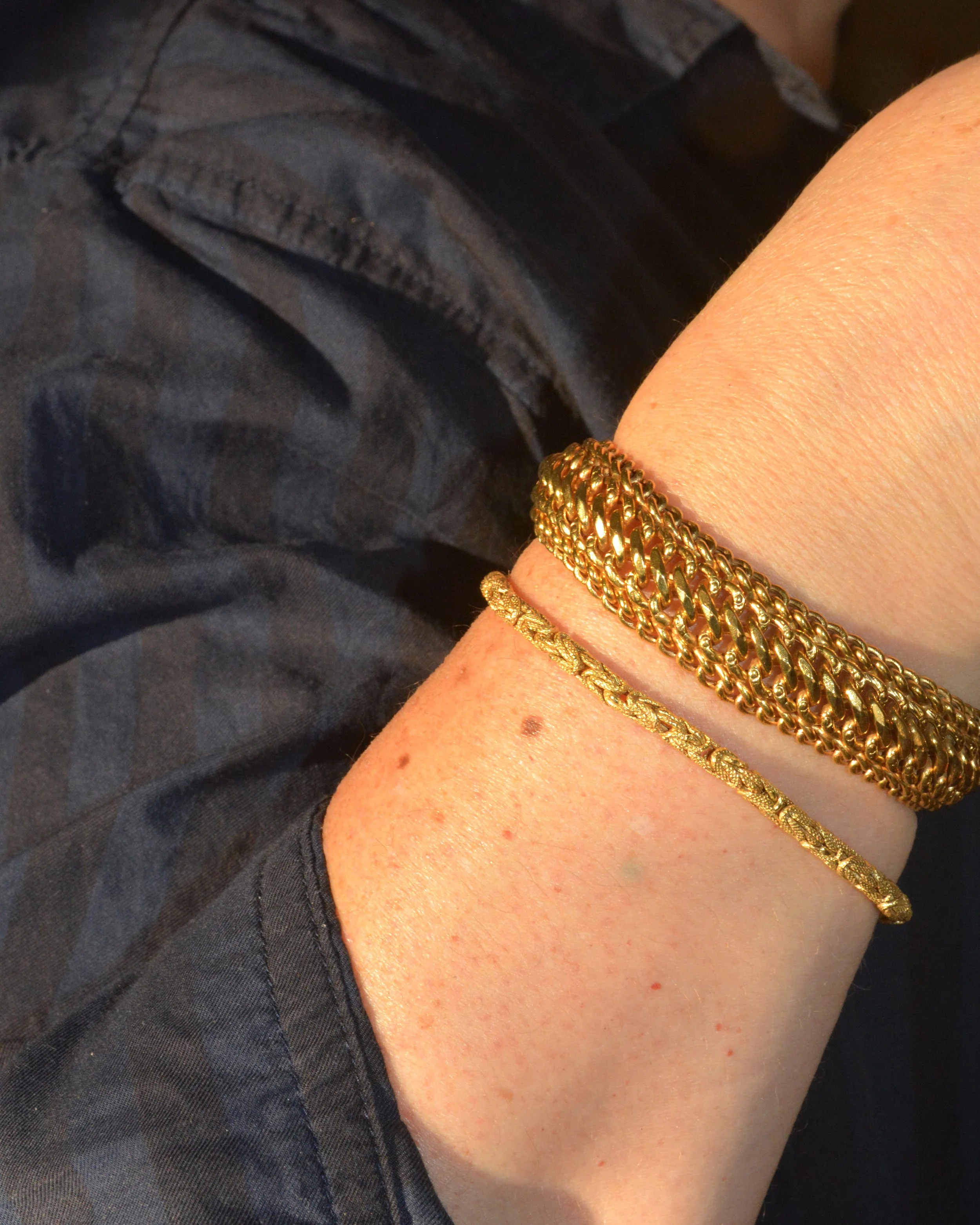
This project was guided by the idea that meaningful objects are preserved, not styled. The identity was designed to feel gentle and enduring, allowing space for sentiment and memory rather than visual noise.
Large-Scale Brand Installation
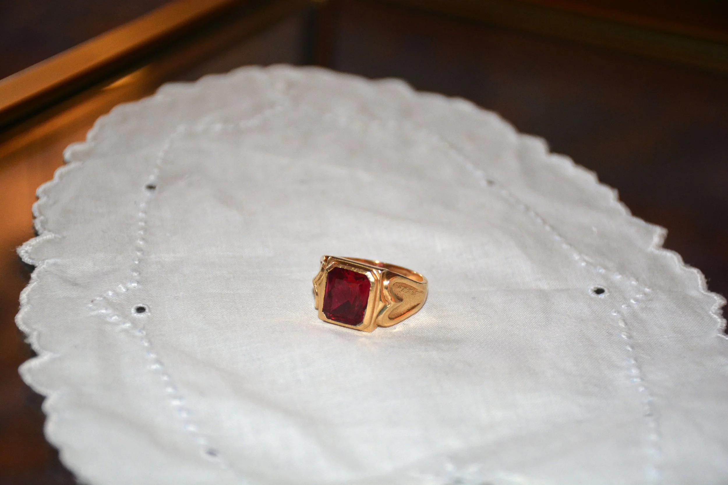
The visual system balances softness and structure to reflect the emotional weight of heirloom pieces while maintaining clarity and restraint.
Design decisions included:
A muted, neutral color palette inspired by aged metals and worn interiors
Soft, understated typography to evoke intimacy and familiarity
Minimal layouts that prioritize negative space and allow objects to feel carefully held rather than displayed
Every element was chosen to support a sense of preservation, quiet beauty, and emotional resonance.