Developed brand identity for a small-batch coffee company, focusing on warmth, ritual, and everyday use.
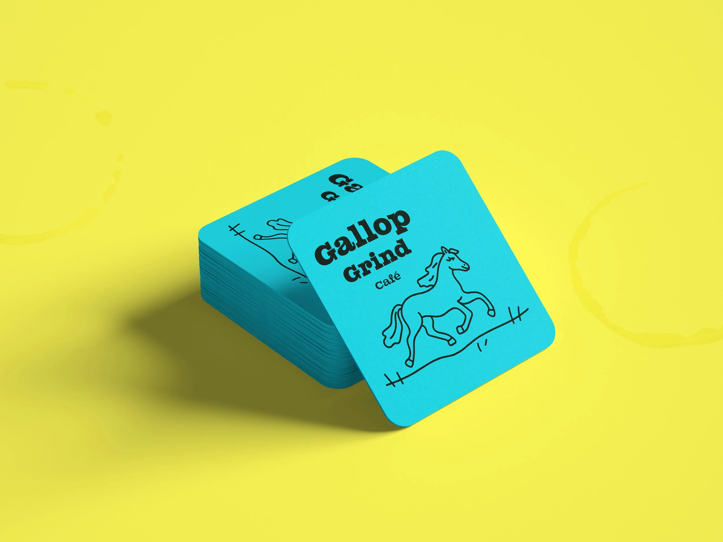
Smaller, right image: Early exploration, including a secondary colorway and an initial, unresolved logo direction.
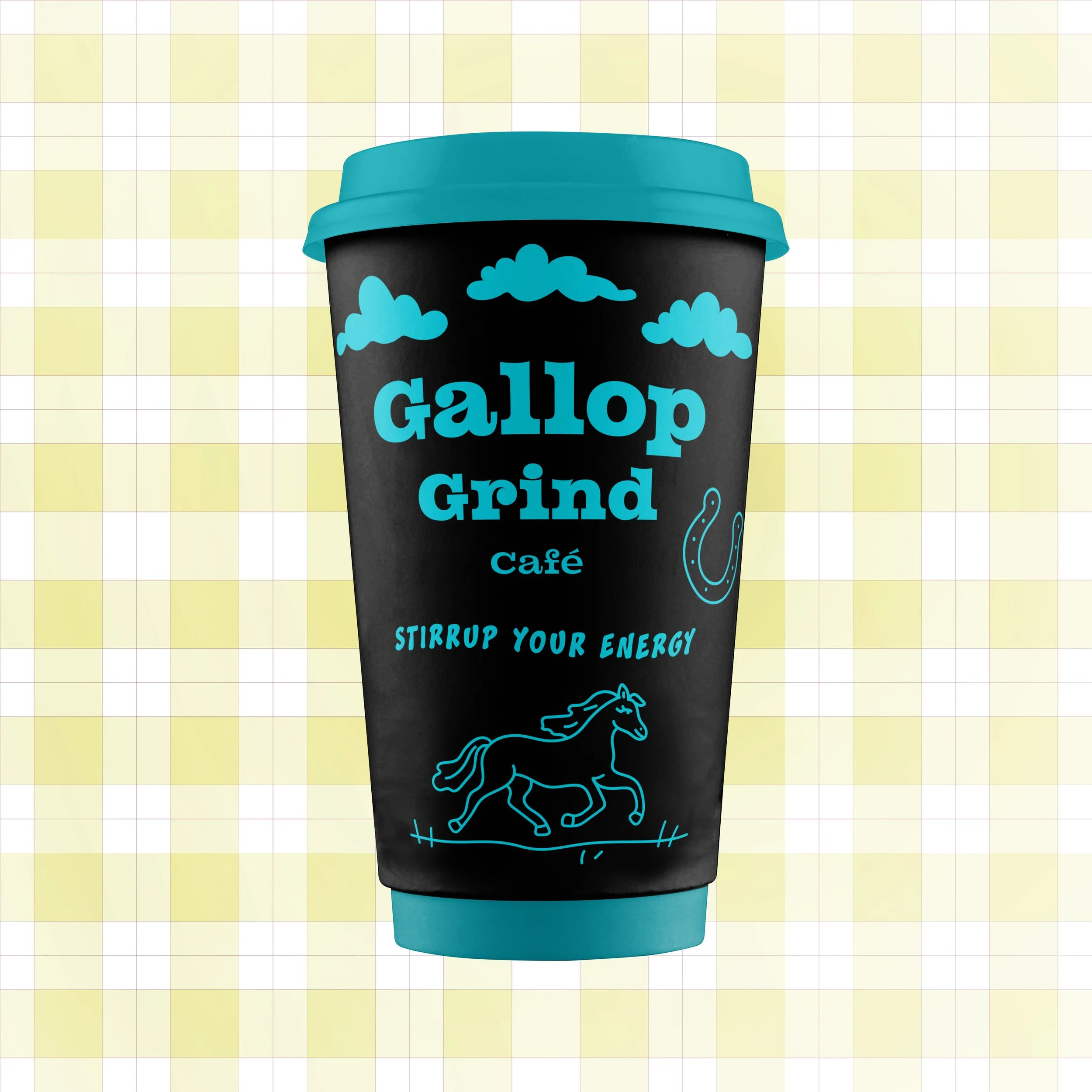
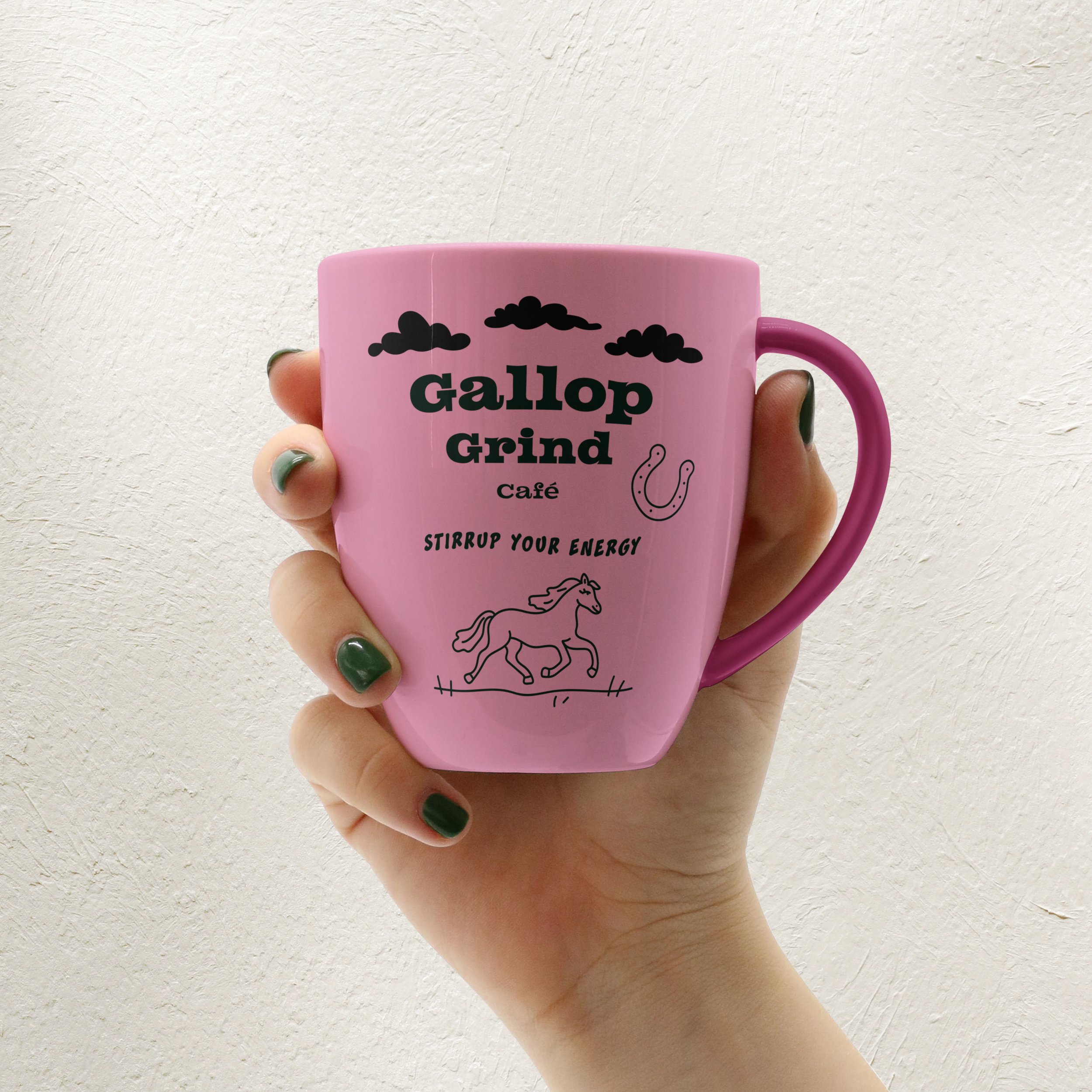
Gallop Grind Coffee
Brand Identity & Visual System
Role:
Brand Strategy, Visual Identity, Illustration, Art Direction, Typography
Objective:
Develop a contemporary coffee brand that rejects nostalgic café tropes and instead centers momentum and ritual.
Positioning Insight:
Most emerging coffee brands lean into craft heritage. Gallop Grind was designed to disrupt that visual language with movement-driven typography and bold graphic restraint.
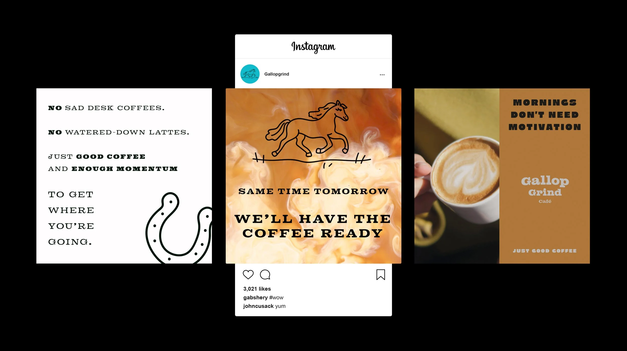
Selected social posts demonstrating brand voice and tone.
Many specialty coffee brands lean heavily in one direction, either rustic and understated, or overly polished and precious. I wanted Gallop Grind to sit somewhere in between: modern, graphic, and intentional, but still approachable.
The challenge was building a system that struck that balance and could work consistently across packaging, digital, and physical spaces.
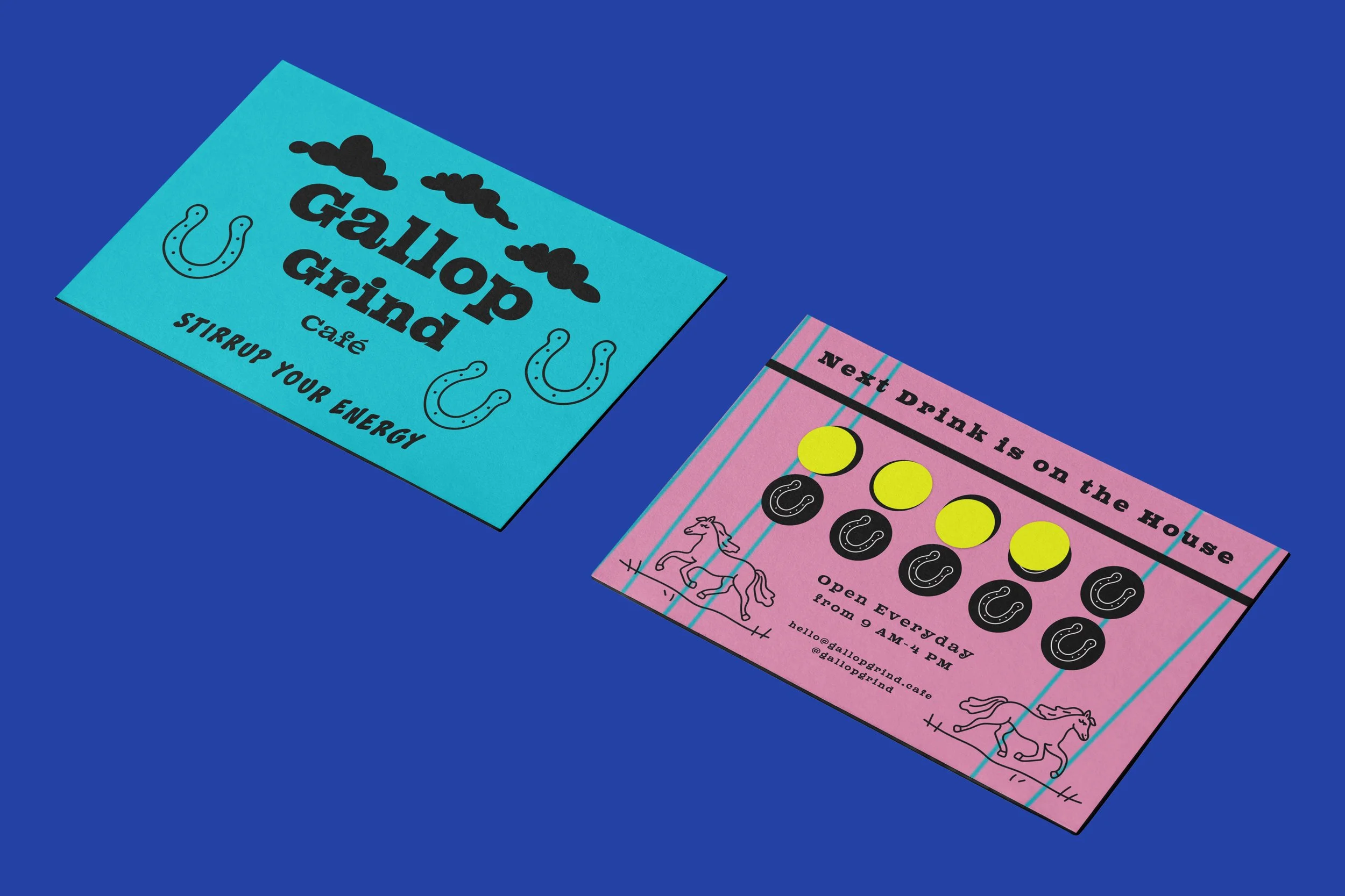
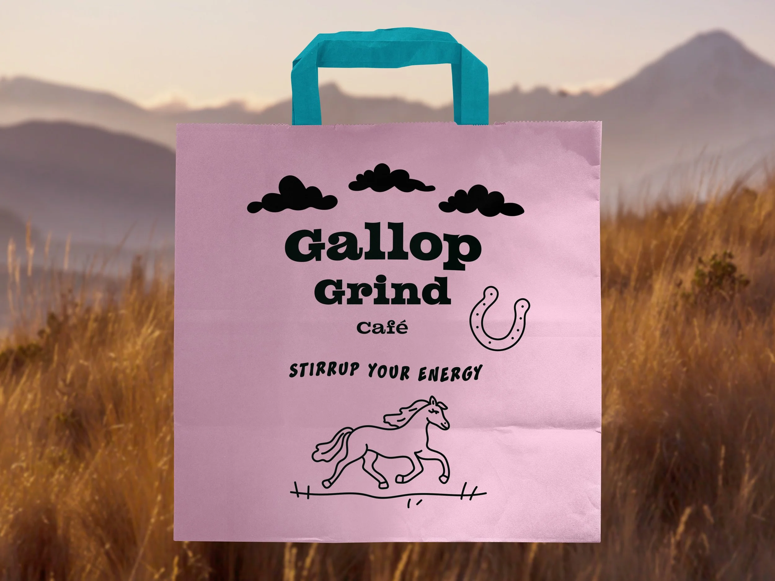
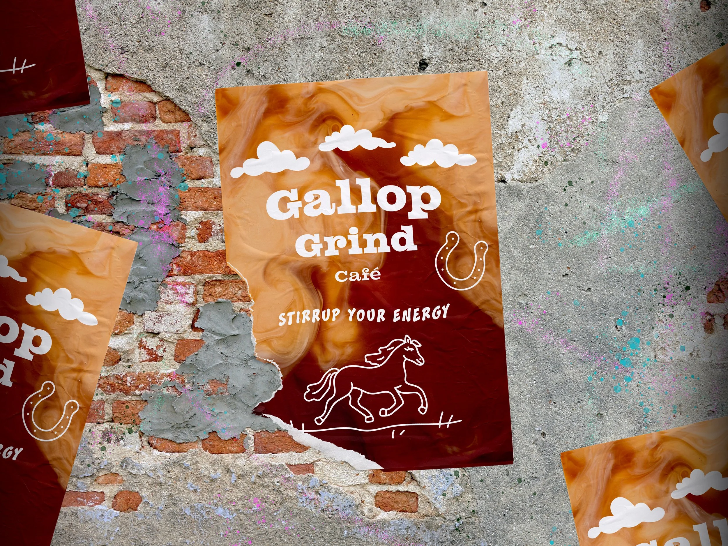
The core idea behind Gallop Grind is forward motion. The name suggests pace and energy, so I leaned into that through bold typography, strong contrast, and a tight graphic layout system.
Rather than using soft textures or organic cues, the identity relies on sharper forms and confident type to give the brand a sense of drive. Everything was designed as part of a flexible system that could grow and adapt without losing its character.
I led the project from concept through execution, developing the overall brand direction and visual system. This included defining the typography, color palette, and tone, and applying those decisions consistently across different touchpoints.
Throughout the process, the goal was to keep the brand cohesive and scalable, grounded in a clear idea rather than a single aesthetic moment.
Overall, this project reflects how I approach brand design: starting with a clear concept, making intentional visual decisions, and building systems that feel flexible, and grounded.
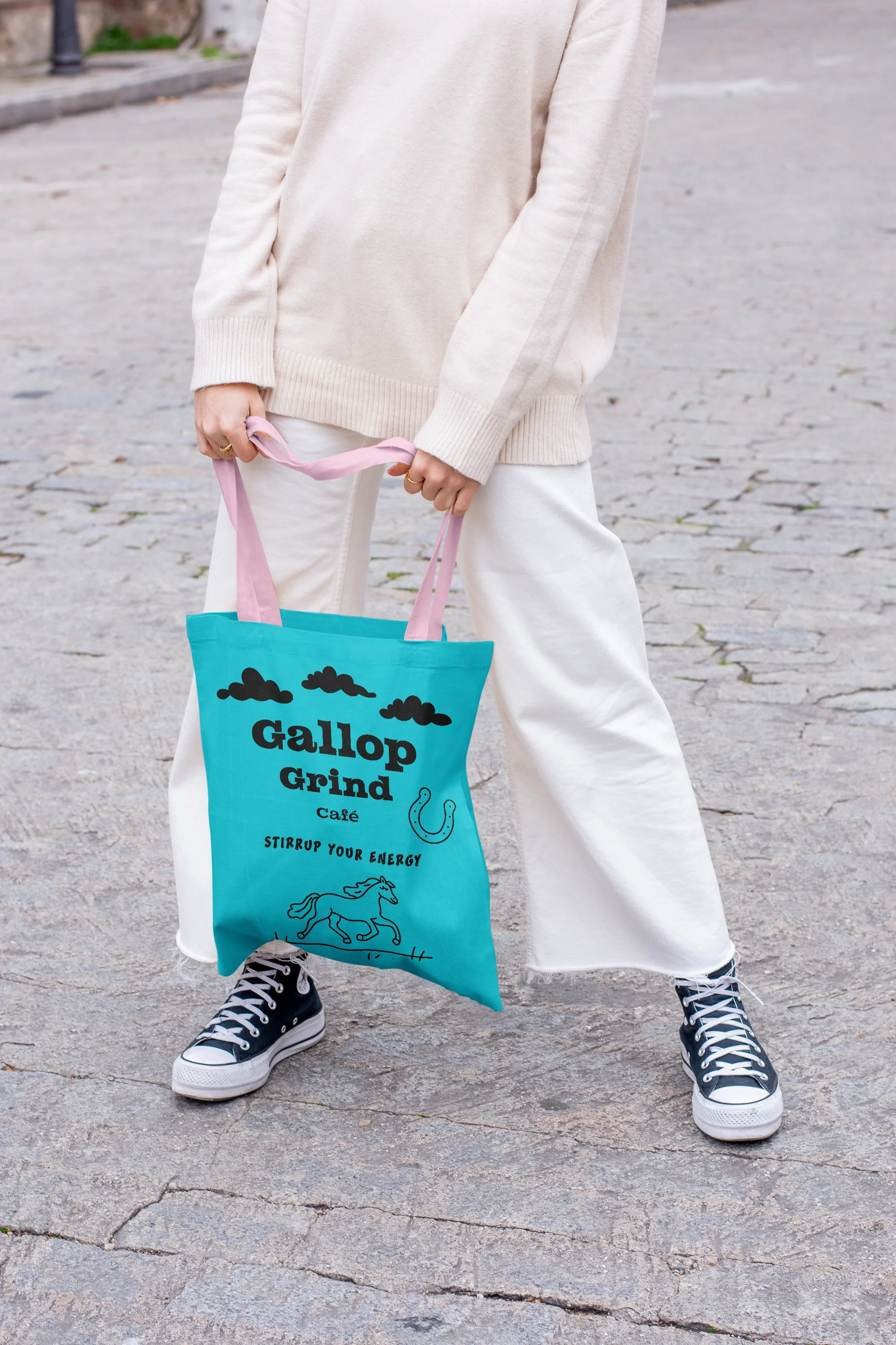
I intentionally avoided the hand-drawn and rustic cues common in coffee branding, using sharper typography and contrast instead to give the brand a more driven, contemporary feel.
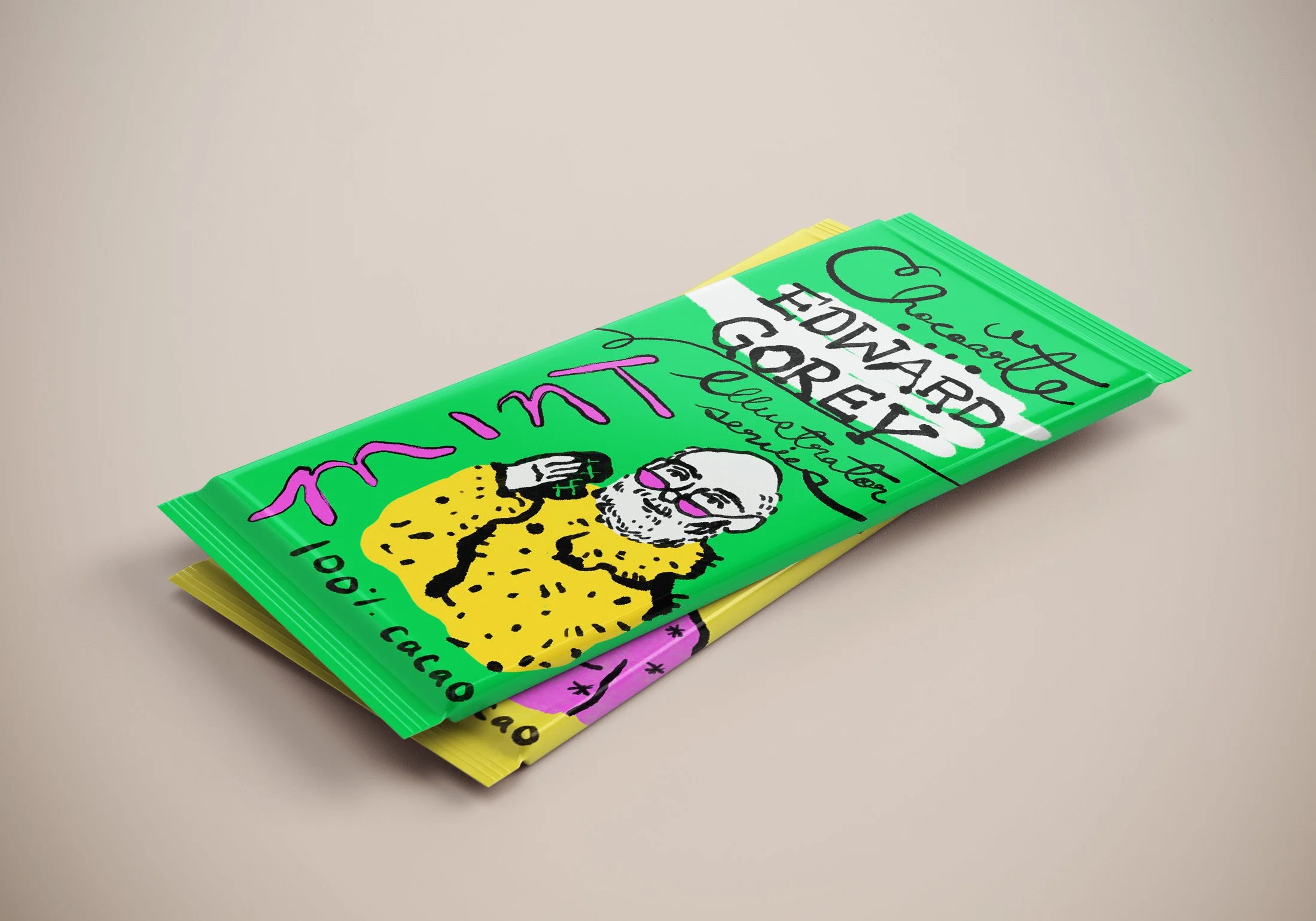
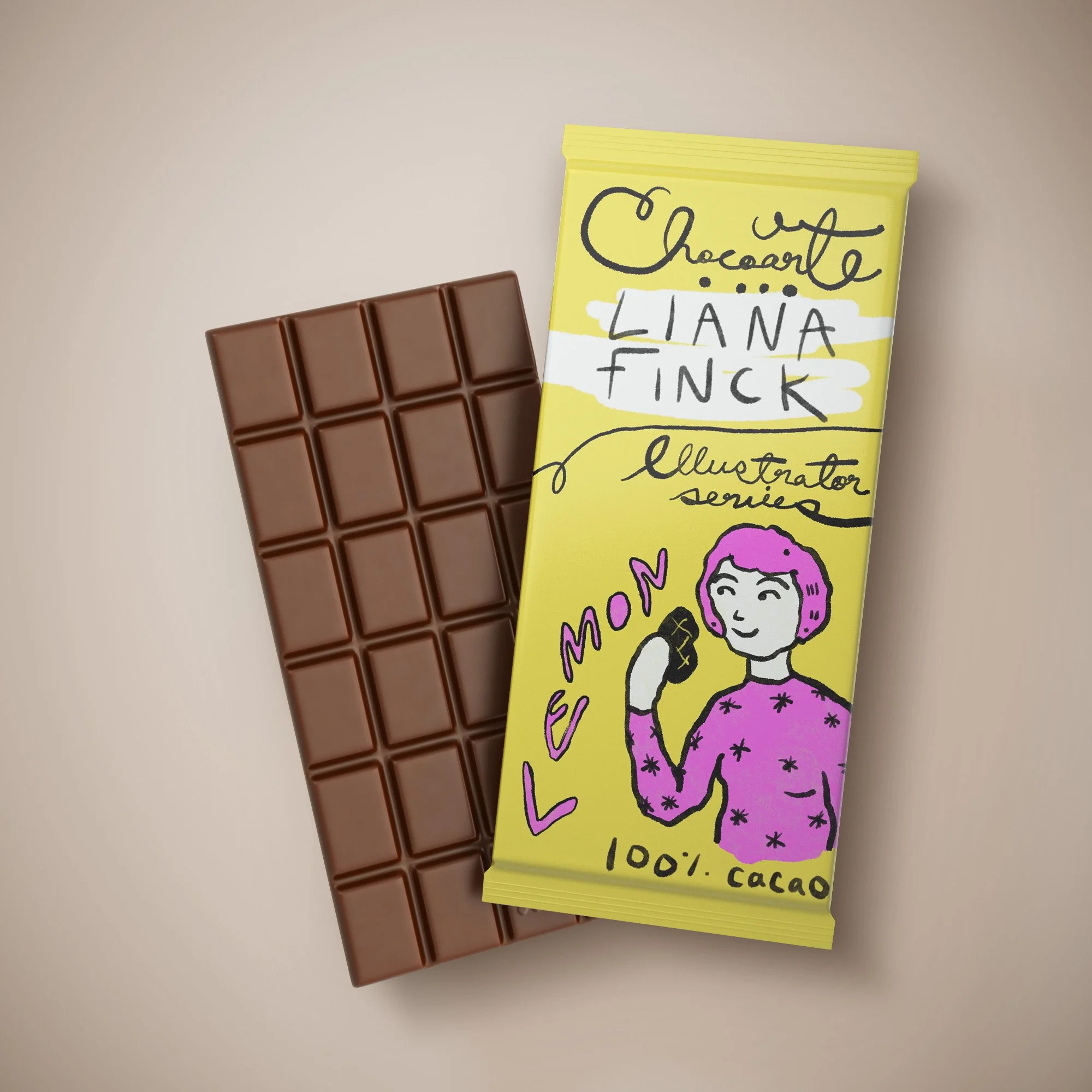
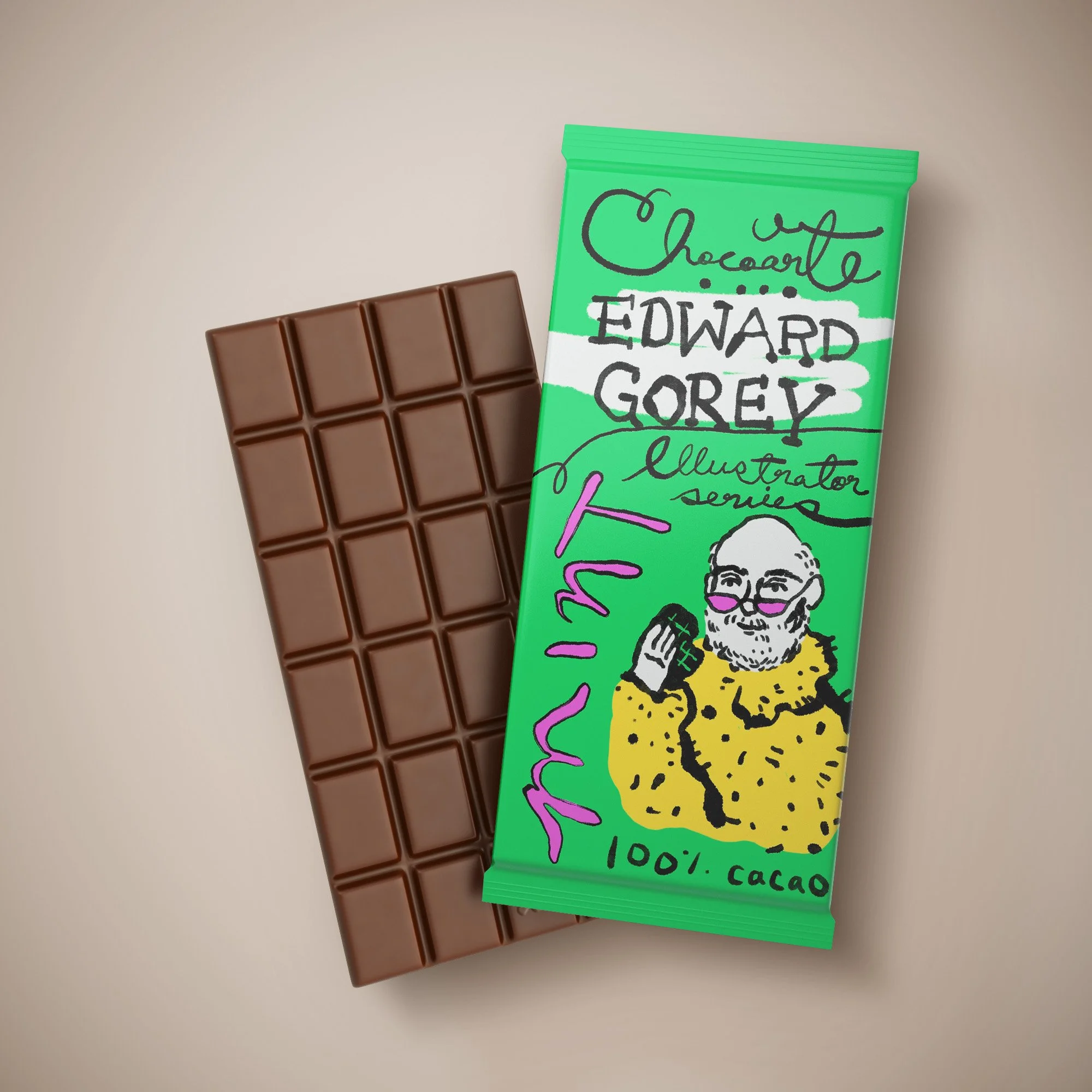
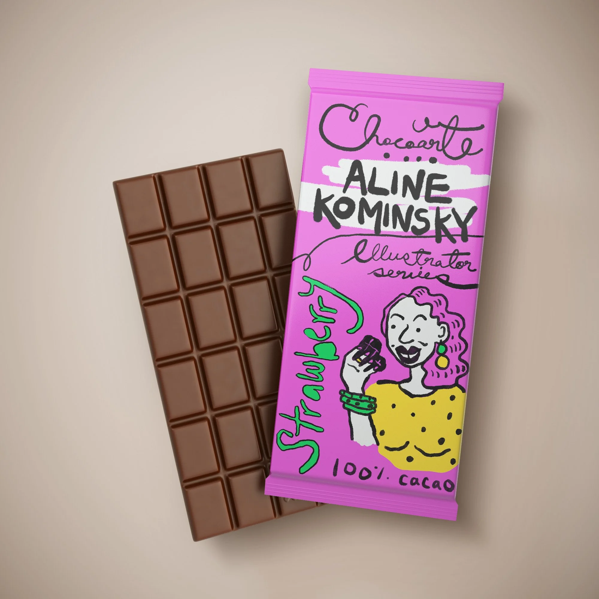
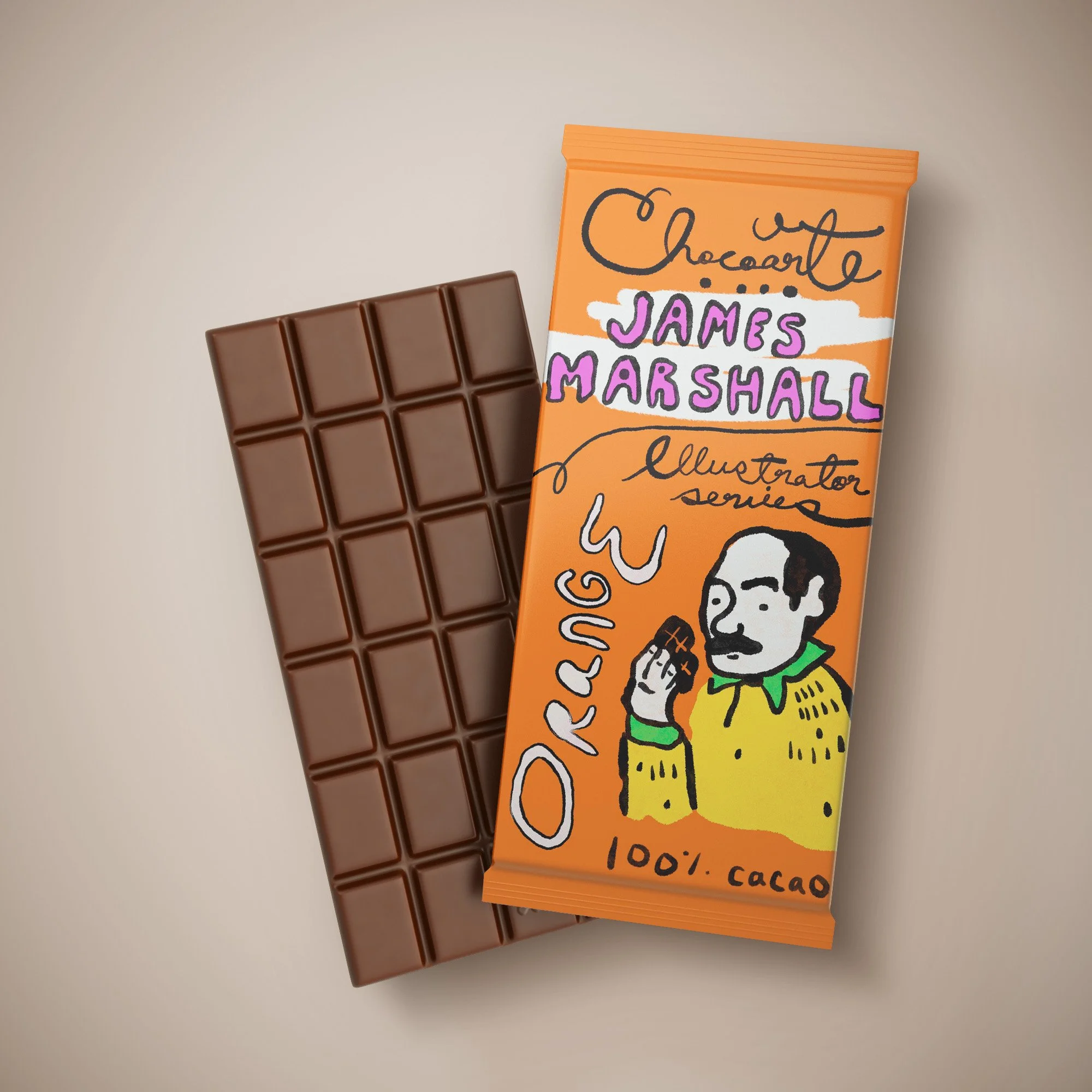
Chocolate Bars
Illustration + Hand lettering + Design by: Gabriella Shery
I developed Chocolate Bars: Illustrators Series, an artisanal wrapper concept celebrating illustrators I admire. The goal was to combine original illustration, hand-lettering and premium packaging to transform a simple product into a collectible shelf piece.
This packaging concept sharpened my integrated design lens—bridging illustration, brand identity, and packaging experience. It reinforced my belief that packaging can function not just as container but as narrative surface.
Drawing inspiration from vintage printmakers’ portfolios, I created hand-lettered titles and custom icons for each illustrator edition. A minimal foil wrapper paired with textured paper evokes craft and collectability. The palette shifts subtly between editions—deep indigo for one, muted ochre for another—keeping the series unified but distinct.
The final deliverables included: full-wrap foil master, inner paper sleeve with hand-lettered illustrator name, collectible insert card, and display-stand artwork for retail. Mock-ups show how the bars live on shelf, and in flat illustration-style layouts.